précédent
suivant
action
action = sur la plupart des slides, il se passe quelque chose quand on clique dessus (surtout la slide 18 :-)
previous
next
action
action = on most slides, something happens when you click (especially slide 18 :-)
Animez vos pages HTML5
Martin Gorner
Animate your HTML5
with CSS3 and SVG
Martin Gorner
Dataconnexions II, Paris, June 20, 2012
1. Les Transitions
1. CSS transitions
left : 0px;
onclick
left : 500px;
--self--
--self--
--self--
left: 0px;
-webkit-transition : 1s;
onclick
left: 500px;
-webkit-transition : 1s;
--self--
--self--
--self--
On peut combiner les propriétés CSS.
left: 0px;
-webkit-transform:
        rotate(0deg);
-webkit-transition: 1s;
onclick
left: 500px;
-webkit-transform:
        rotate(360deg);
-webkit-transition: 1s;
A transition can animate multiple CSS properties
--self--
--self--
--self--
-webkit-transition-timing-function:
ease (default)
ease-in
ease-out
ease-in-out
linear
--self--
--self--
--self--
--self--
--self--
Profil de vitesse en
-webkit-transition: 1s
cubic-bezier(0, 0.9, 0.1, 1);
Cubic Bezier
speed function
1. Transitions (résumé)
          -webkit-transition:

          -webkit-transition-delay:
          -webkit-transition-duration:
          -webkit-transition-property:
          -webkit-transition-timing-function:
1. CSS transitions (summary)
--self--
2. Les Animations
2. CSS animations
2. Animations et Keyframes
.move { -webkit-animation : anim1 5s linear infinite; }
@-webkit-keyframes anim1
{
from {-webkit-transform: rotate(0deg); }
to {-webkit-transform: rotate(360deg); }
}
2. Animations and keyframes
--self--
--self--
2. Animations et Keyframes
.move {-webkit-animation : anim2 ease-in-out 3s infinite alternate; }
@-webkit-keyframes anim2
{
from {left: 0px; -webkit-transform: scale(1.0) rotate(0deg) }
50% {left: 250px; -webkit-transform: scale(0.8) rotate(10deg) }
to {left: 500px; -webkit-transform: scale(1.2) rotate(-20deg) }
}
2. Animations and keyframes
--self--
--self--
2. Animations (résumé)
          -webkit-animation:

          -webkit-animation-name:
          -webkit-animation-delay:
          -webkit-animation-duration:
          -webkit-animation-direction:
          -webkit-animation-fill-mode:
          -webkit-animation-timing-function:
          -webkit-animation-iteration-count:
2. CSS animations (summary)
--self--
3. Les Transformations 2D en CSS3
3. CSS transforms in 2D
Transformations géométriques 2D
-webkit-transform: -webkit-transform: -webkit-transform:
liste complète des transformations 2D:
2D geometric transforms
Full list of 2D transform functions:
--self--
Transformations géométriques 2D
On peut spécifier l'origine de la transformation.
-webkit-transform-origin: 0% 100%;
-webkit-transform: rotate(360deg);
2D geometric transforms
You can set the origin of the transform.
Quelques autres effets utiles
-webkit-opacity: 0.4 -webkit-box-shadow: -webkit-box-reflect:
opacity box-shadox box-reflection
A few additional useful effects
--self--
--self--
--self--
--self--
4. Les Transformations 3D en CSS3
4. CSS transforms in 3D
Transformations géométriques 3D
rotateX, rotateY, rotateZ, rotate3d, matrix3d
-webkit-transform: rotateY(360deg);
3D geometric transforms
--self--
Transformations géométriques 3D
translateX, translateY, translateZ, translate3d
-webkit-transform: translateZ(150px)  /* first picture */
-webkit-transform: translateZ(-150px) /* second picture */
3D geometric transforms
--self--
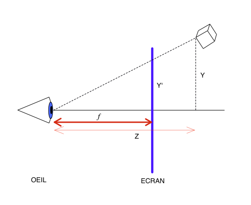
La perspective
Ce n'est pas ce qu'on veut: il manque la perspective!Cliquer pour la rajouter.
-webkit-perspective: 1000px;
Perspective
That is not what you wanted: there is no perspective!
Click to add it.
--self--
La perspective
-webkit-perspective: f
Perspective
--self--
--self--
La propriété transform-style
-webkit-transform-style: flat ; /* default value */
The transform-style property
--self--
--self--
--self--
La propriété transform-style
-webkit-transform-style: preserve-3d ;
The transform-style property
--self--
--self--
--self--
Bonne habitudes pour travailler en 3D
SCENE {-webkit-perspective: 1000px}
Best prectices for working in 3D
--self--
--self--
--self--
--self--
Les CSS du cube 3D
.SCENE {
-webkit-perspective: 1000px;
width: 600px;
height: 340px;
}
.OBJECT {
-webkit-transform-style: preserve-3d;
-webkit-transform: rotateX(0deg) rotateY(0deg) rotateZ(0deg);
position: absolute;
width: 100%;
height: 100%;
}
.FACE {
position: absolute;
left: 165px;
top: 15px;
}
.FACE.im1 { -webkit-transform: translateZ(150px) ; }
.FACE.im2 { -webkit-transform: translateZ(-150px); }
.FACE.im3 { -webkit-transform: translateX(150px) rotateY(90deg);}
.FACE.im4 { -webkit-transform: translateX(-150px) rotateY(-90deg);}
.FACE.im5 { -webkit-transform: translateY(150px) rotateX(90deg);}
.FACE.im6 { -webkit-transform: translateY(-150px) rotateX(-90deg);}
The CSS of the 3D cube
--self--
--self--
--self--
CSS 3D: animations, transition et transformation peuvent être combinées
CSS 3D: animations, transitions and transforms can be combined
5. Scalable Vector Graphics (SVG)
--self--
SVG: les primitives
<image x y width height xlink:href>
<svg>
	<rect x="5" y="5" width="140" height="140" stroke="#000000"
	stroke-width="4" fill="#AAAAFF" opacity="1"/>
</svg>
SVG: primitives
SVG: path - l'outil à tout faire
L - ligne
C - bézier cubique
Q - bézier quadratique
A - arc d'ellipse
M - Marqueur (nlle. pos. stylo)
z - pour fermer la courbe
Q
C
<svg>
	<path d="M 30,240 Q 170,40 260,230" stroke="#F00" />
	<path d="M 30,240 C 70,90 210,150 260,230" stroke="#F00" />
</svg>
utilisez:
SVG: path - the all-purpose tool
L
- line
C
- cubic bézier
Q
- quadratic bézier
A
- elliptic arc
M
- marker (new pen position)
z
- to close the path
--self--
--self--
--self--
--self--
--self--
--self--
use:
--self--
SVG: Transformations géométriques 2D
transform = transform = transform =
liste complète des transformations 2D:
<rect ... transform="translate(10,10) rotate(25) scale(2)">
SVG: geometric transforms in 2D
full list of 2D transforms:
--self--
--self--
SVG+SMIL: animation sur un attribut
<circle cx="200" cy="205" r="80" >
	<animate dur="3s" attributeName="r" values="80; 150; 80"
	repeatCount="indefinite" />
</circle>
SVG+SMIL: animating an attribute
SVG+SMIL: l'attribut peut être le 'd' d'un tag path!
<path fill="#fff">
<animate attributeName="d" dur="2s" repeatCount="indefinite"
values="m 0,0  c  1,15 -13,45  -45,45  -32,0 -44,-28 -44,-44  z;
        m 0,0  c -4,15 -66,106 -98,106 -32,0   3,-89   9,-105 z" />
</path>
SVG+SMIL: the attribute can be the 'd' of a path tag!
SVG+SMIL: animateTransform
<g> ... <!-- formes SVG groupées ici -->
  <animateTransform dur="3s" repeatCount="indefinite" additive="sum"
  attributeName="transform" type="translate" values="0,0; 200,-130" />
  <animateTransform dur="3s" repeatCount="indefinite" additive="sum"
  attributeName="transform" type="rotate" values="0; 20" />
</g>
--self--
SVG primitives group
--self--
SVG+SMIL: animateMotion
<g>
   ... <!-- formes SVG groupées ici -->
   <animateMotion dur="1s" repeatCount="indefinite"
   path="m 0,0 a 15,11 0 1 1 -30,0 15,11 0 1 1 30,0 z" />
</g>
--self--
SVG primitives group
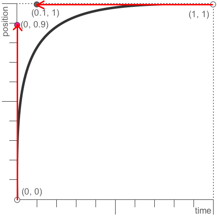
SVG+SMIL: vitesse d'animation avec keySplines
1
temps
1
position
0
0
0.35 0 0.65 1
<animateTransform calcMode="spline"
dur="3s" attributeName="transform"
type="rotate" repeatCount="indefinite"
keySplines="0.35 0 0.65 1; 0.35 0 0.65 1 "
values="20,310,400; -20,310,400; 20,310,400 " />
SVG+SMIL: animation speed with keySplines
--self--
time
--self--
--self--
--self--
--self--
--self--
--self--
--self--
--self--
--self--
--self--
SVG: contrôle de l'animation avec les attributs begin, end et fill
<animate begin="..." end="..." fill="freeze" ... />
Un temps:
begin="1s"
Un événement souris:
begin="buttonID.click"
Un événement d'animation:
begin="animID.end"
Une combinaison de tout ça:
begin="animID.end + 1s; 10s"
SVG: controlling the animation with the begin, end and fill attributes
--self--
A time:
A mouse event:
An animation event:
A combination of all that:
SVG: contrôle de l'animation en javascript
unpauseAnimations()
pauseAnimations()
setCurrentTime(0)
<g onclick="document.getElementById('svg_id').pauseAnimations() ">...</g>
SVG: controlling the animation in javascript
--self--
--self--
--self--
--self--
Les 4 techniques d'animation en HTML5
CSS3 déclaratif objets HTML uniquement, aucun contrôle de trajectoire SVG + SMIL déclaratif courbes, trajectoires courbes mais préprogrammées Canvas + Javascript programmatique boucle d'animation avec modèle et interactions libres, 2D uniquement WebGL programmatique full 3D
4 HTML5 animation techniques
CSS3
declarative
only HTML objects, no control over trajectory
SVG+SMIL
declarative
curves, curved trajectories, but only preprogrammed ones
Canvas+Javascript
programmatic
animation loop with interactive world model, 2D only
WebGL
programmatic
full 3D
--self--
Contact: Martin Gorner , Relations Développeurs, Google
gplus.to/martin.gorner
Cette présentation est en ligne:http://animateyourhtml5
Plus d'infos:http://html5rocks
--self--
--self--
, Developer Relations, Google
--self--
--self--
This presentation is online:
--self--
--self--
--self--
More information:
--self--
--self--
--self--
 suivant


 INKSCAPE
 chrome